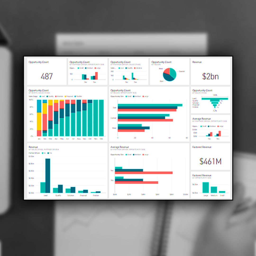
Why Power BI Dashboards Beat Traditional Survey Reports
If you’ve spent time and money gathering survey data, the last thing you want is for the results to end up in a long, static report that nobody really reads. We definitely don’t!
Sure, PDFs, Excel sheets, and Word documents have their place - but they often make it hard to spot trends, understand what’s really going on, or explore the data in detail.
That’s where Power BI dashboards come in. They turn survey results into interactive visuals that are not only easier to digest but also more useful for making decisions.
1. See the Story Behind the Numbers
Static reports are often full of tables and long paragraphs — and let’s be honest, who has time to sift through all that? Power BI dashboards take the same data and transform it into charts, graphs, and key metrics that make it clear what’s important.
You can quickly spot trends, compare results, or drill into specific areas — all without wading through endless pages.
2. Explore Your Data Your Way
One of the best things about dashboards is that they’re interactive. You can:
Filter by location, demographic, or time period.
Drill down to see the details behind the numbers.
Compare different datasets side by side.
The filtering ability in BI is immeasurably helpful. Both in terms of speed for yourself, to find the data and trends you’re looking for. But also as a tool for sharing the data with other parts of your organisation.
3. Always Up to Date
Static reports get outdated fast. Add new survey responses? You need a whole new report. With Power BI, dashboards can refresh automatically as new data comes in. That means you’re always looking at the latest insights - no waiting, no version control headaches.
We’ve found, for our clients, a client portal page with access the dashboard works best.
4. Share Insights, Easily
Sharing a PDF or Excel sheet often means emailing around big files or juggling multiple versions. Power BI dashboards live online, so anyone on your team can access them anytime.
Everyone sees the same up-to-date insights, making collaboration and decision-making far easier.
5. Turn Insights Into Action
The real power of a dashboard isn’t just showing data — it’s helping you act on it.
Housing providers can spot trends in tenant satisfaction and fix issues faster.
Charities can monitor programme impact across different groups.
Businesses can identify pain points and prioritise improvements.
Dashboards make it simple to turn raw survey responses into meaningful action.
Bring Your Survey Results to Life
At Viewpoint, we don’t just collect survey data — we help you understand it and use it. Our Power BI dashboards make your results visual, interactive, and actionable, helping you make smarter decisions faster.
Curious to see what your survey results could look like in a dashboard?
Get in touch with Viewpoint today - we’d love to show you.

